WORTH STOPPING FOR.
VISUAL IDENTITY
CAMPAIGN & MARKETING
DIGITAL CONTENT
PRINT & COLLATERAL
Bowser Bean is a growing Victorian & New South Wales convenience and fuel network with a strong focus on community, quality and everyday value. The visual direction brings consistency across digital, campaign and in-store communications while keeping the brand bold, approachable and distinctly local.
HOW DO YOU
ELEVATE
CONVENIENCE?
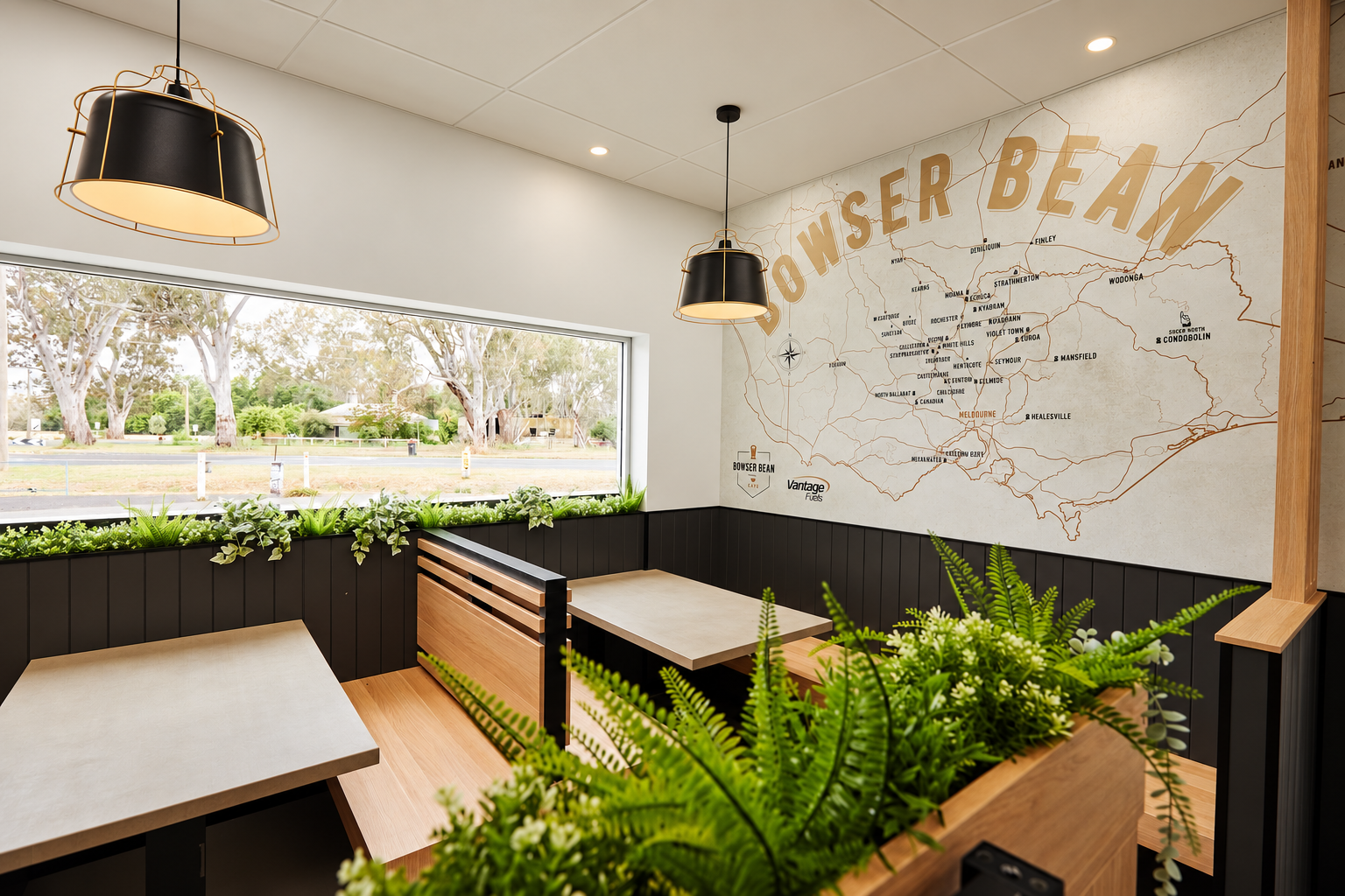
Bowser Bean brand was built from the ground up to bring a more considered approach to everyday petrol convenience. The brand was designed to feel warm and welcoming, creating a place that sits comfortably between the familiarity of a local servo and the quality of a premium café.
The creative direction brings together premium coffee, quality grab-and-go food and everyday convenience within a cohesive brand experience. Every touchpoint was considered to make Bowser Bean feel approachable and distinctly local, while elevating what customers can expect from a regional fuel and convenience destination.
DESIGNED TO BE
WORTH STOPPING
FOR!
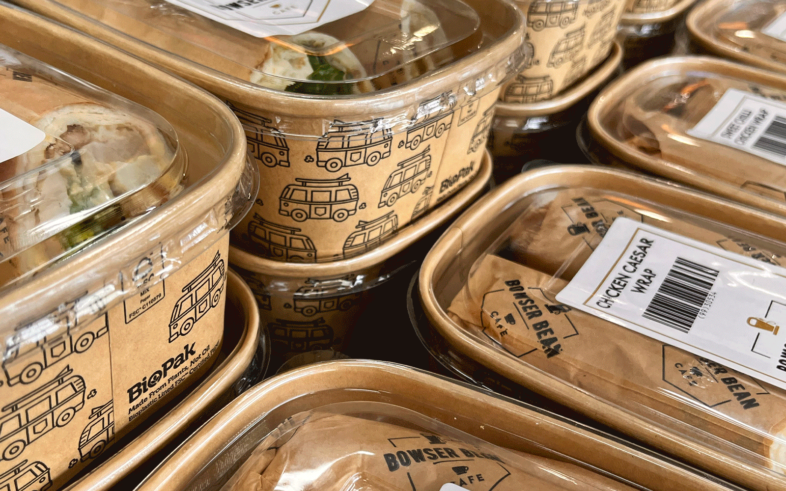
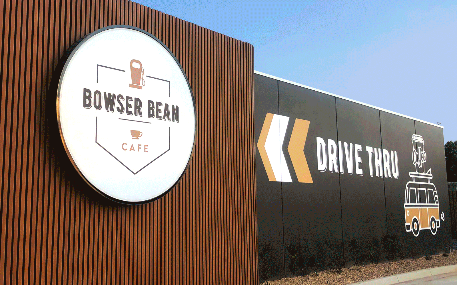
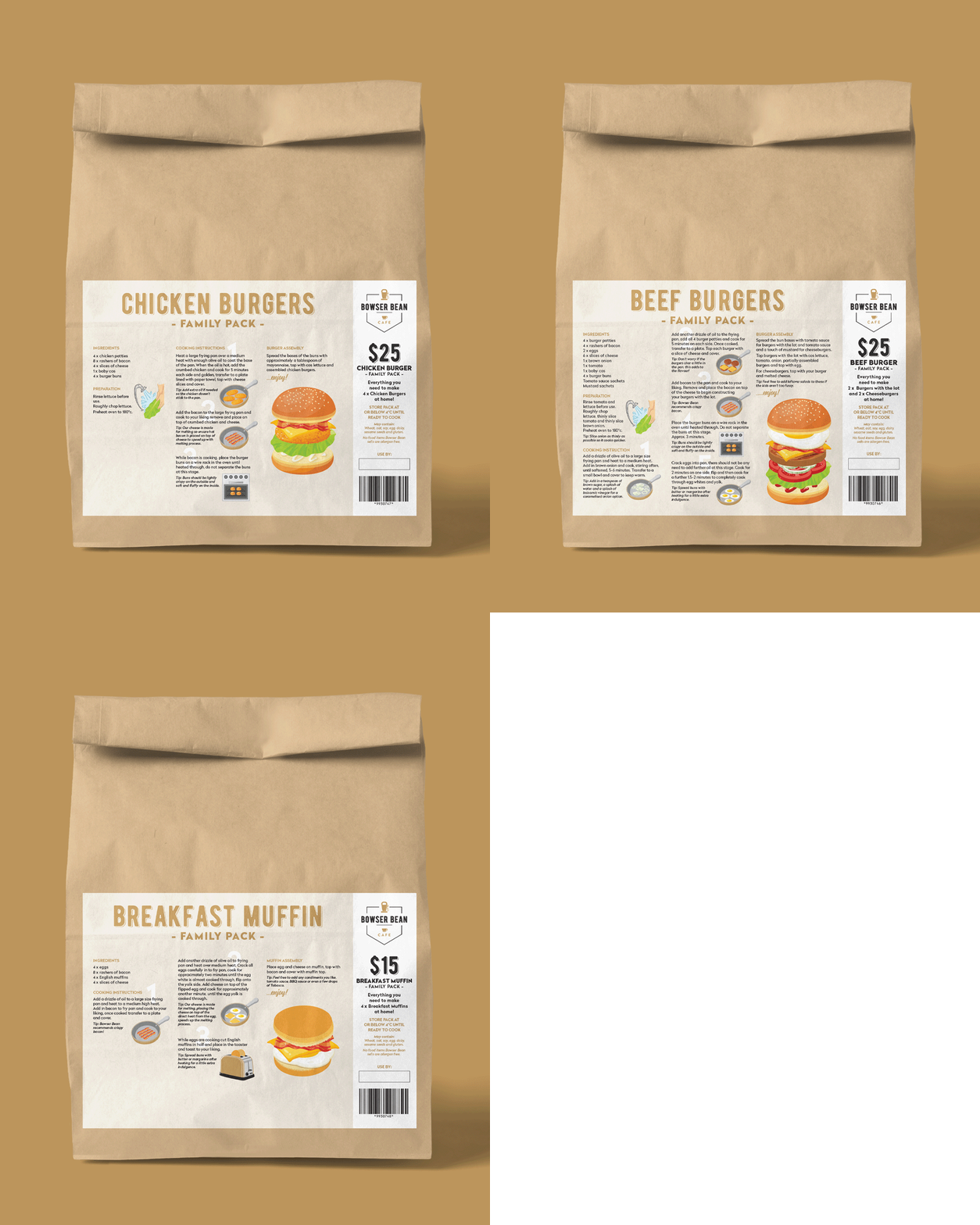
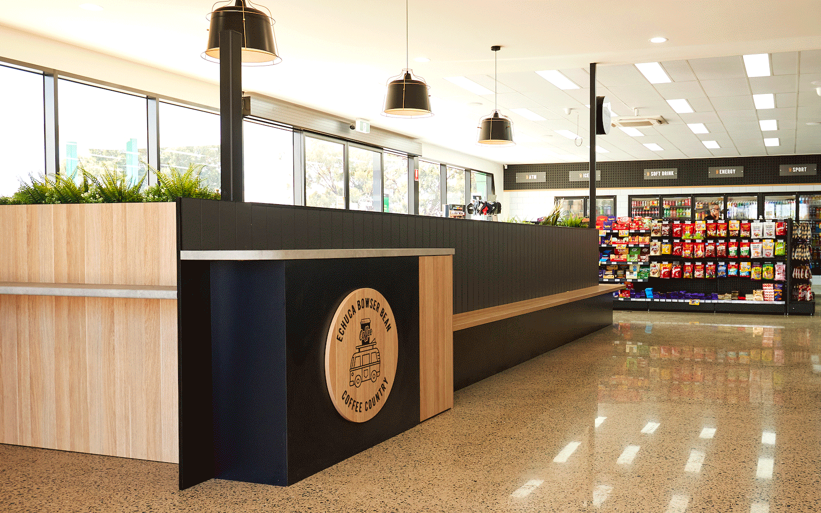
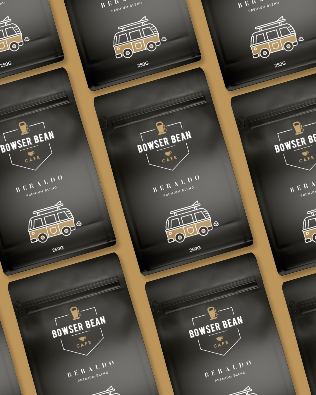
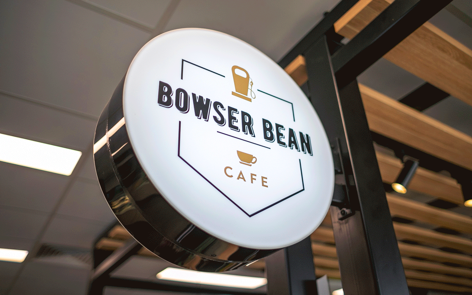
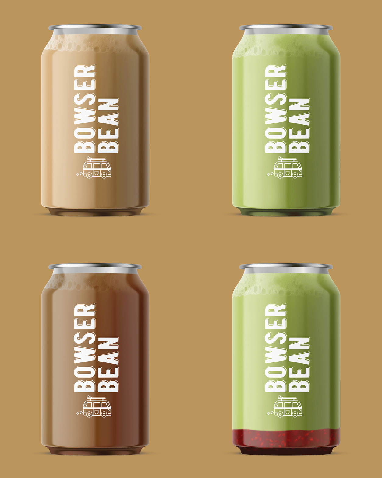
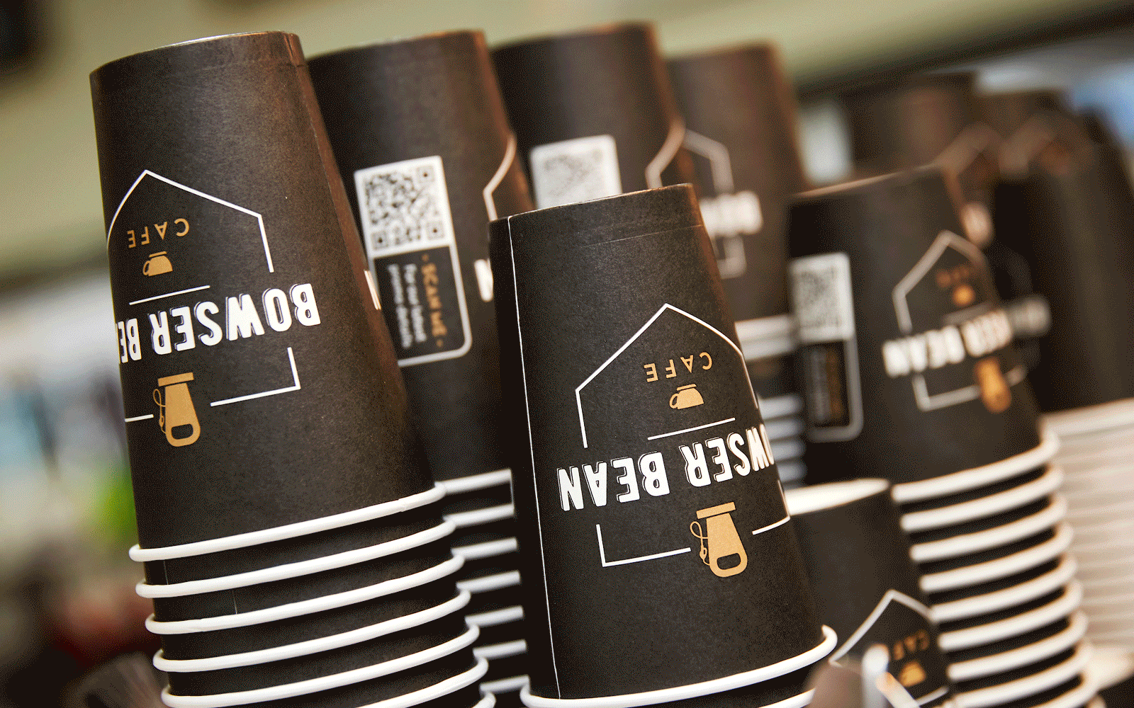
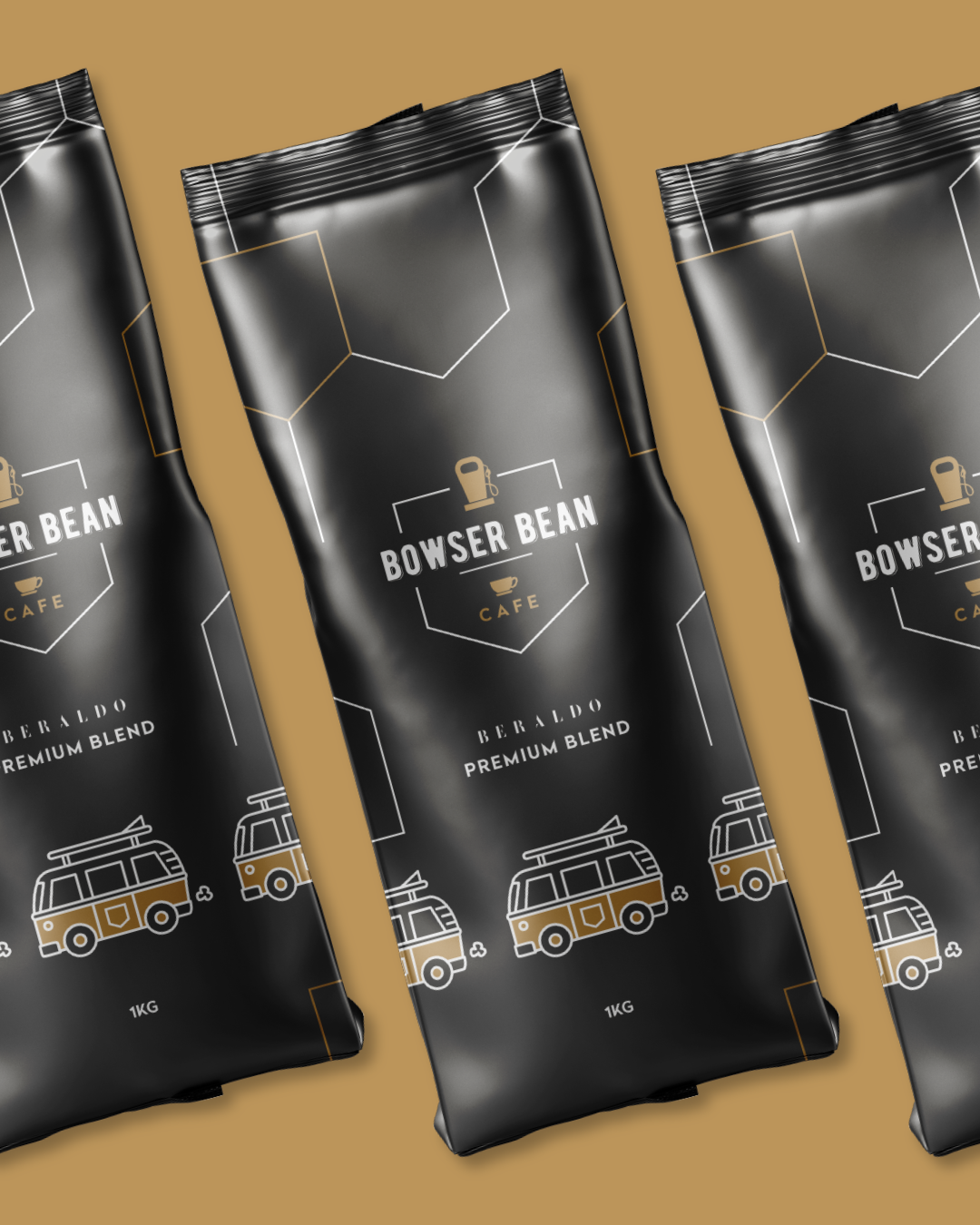
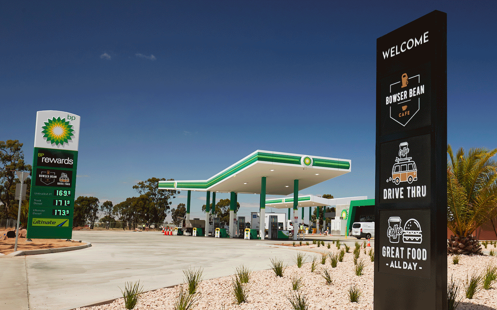
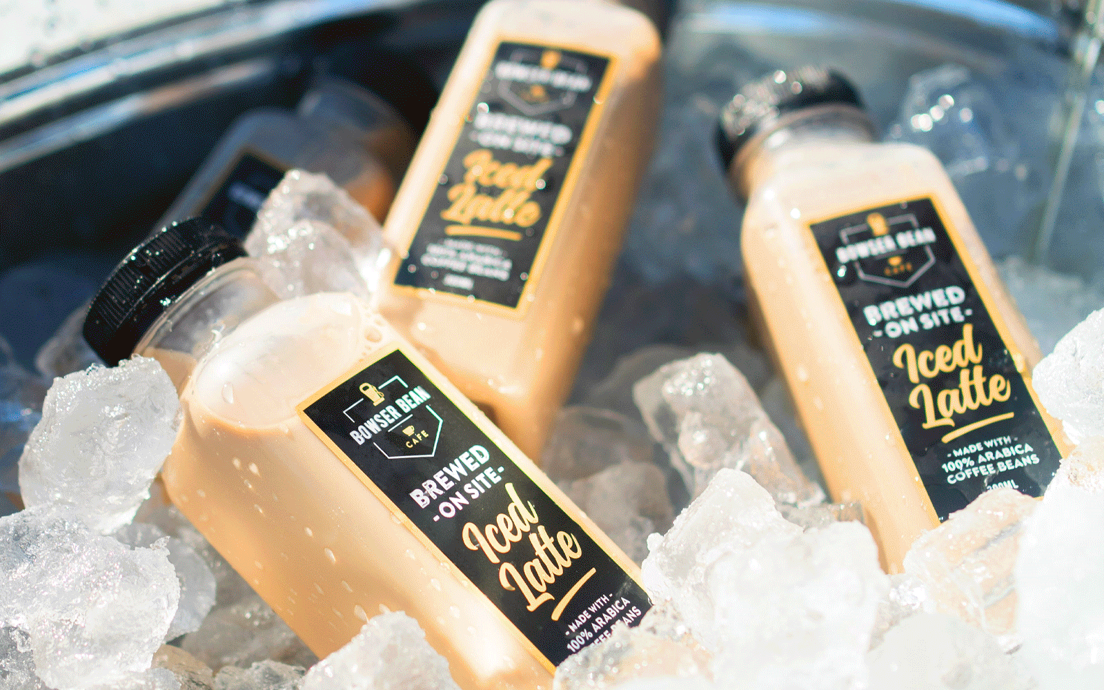
The Bowser Bean identity extends across a complete suite of brand touchpoints, from the primary logo, secondary marks, custom graphics and illustration through to packaging, menus, uniforms, wayfinding, signage and in-store collateral.
Across each local site and beyond, the same visual language carries through campaigns, promotions, digital content, social, print and everything in between — creating a brand that feels consistent, familiar and unmistakably Bowser Bean.